Sent to you by Dominic via Google Reader:
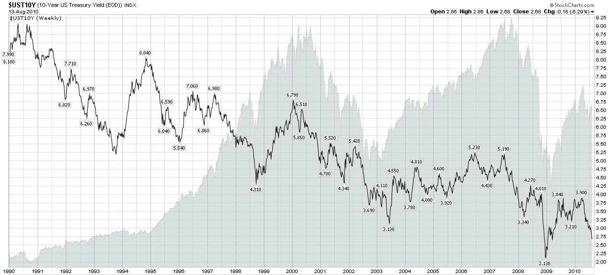
5The speed with which the yield on the 10-Year U.S. Treasury Note dropped from just over 4.00% in early April to just 2.68% as of Friday's close is astonishing – and points to how the bond market is evaluating the prospects for deflation, recession and a prolonged economic malaise, or worse.
This week's chart of the week captures the history of the yield on the benchmark 10-Year U.S. Treasury Note since 1990, when it was hovering in the vicinity of 9%. For additional context I have also included a gray area chart of the S&P 500 index. More often than not, yields on the long bond are positively correlated with equities, but this relationship can decouple, sometimes for an extended period of time.
Those who are interested in the history of the yield curve and may wish to experiment with an interactive tool with yield curve data going back to 1977 may wish to click through to Fidelity's Historical Yield Curve page.
Related posts:
- Chart of the Week: 10-Year Treasury Note Yield
- Chart of the Week: An Incredible Year for Junk Bonds
- Yield Curve Looks Just Like May 2003
- Watch Emerging Markets Bonds
- CWB: A New(ish) Convertible Bond ETF
- The Battle for Bond ETF Supremacy
Disclosure(s): none
Things you can do from here:
- Subscribe to VIX and More using Google Reader
- Get started using Google Reader to easily keep up with all your favorite sites
No comments:
Post a Comment